Google rolls out hiding Chrome extension icons by default
It seems Google is rolling out a user-interface change that will hide Chrome extensions by default. In the last days we have seen the new puzzle piece icon to show up on more and more of our test machines.
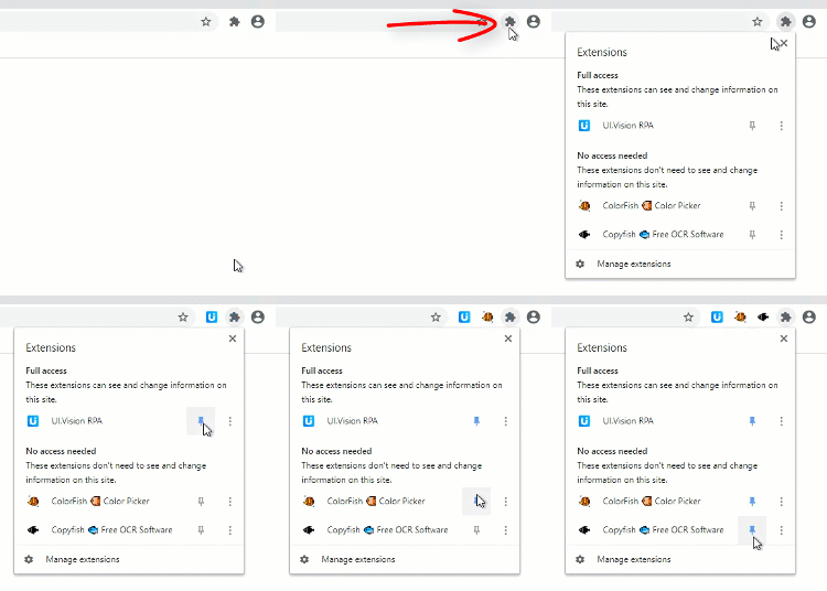
Instead of allowing extension icons to appear one after another to the right of the omnibox – the input box for URLs and search queries – Chrome gets now a design change that hides the graphical buttons in a menu accessed by a puzzle piece icon, called the Chrome Extension Toolbar menu.
Here is it in action:

“Our goal with this new UI is to make it easier for users to see what extensions can access their data,” explained extensions developer advocate Simeon Vincent in a post to the Chromium extensions forum in May 2020.
“When the user clicks the puzzle piece icon, the extension menu opens and displays a list of all enabled extensions the user has installed. The extension list is grouped by the level of data access the extension has on the currently selected tab.”
Our take: First we were sceptical, but after using it for a few days we like it! It is more intuitive to use than it sounds and makes managing extensions easier for everyone.